
Tips for Choosing Calm Colors for Your Home
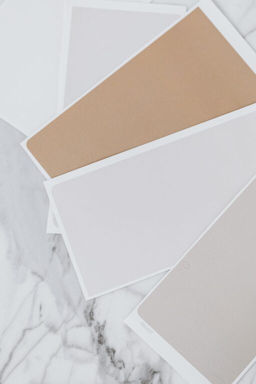
Creating a peaceful and inviting atmosphere in your home starts with the colors you choose. Calm colors can transform any space into a soothing retreat, helping you relax and unwind after a busy day. But with so many shades and tones available, it can be challenging to know where to begin. This guide will walk you through useful tips for choosing calm colors that fit your style and enhance your living space.
Why Choose Calm Colors?
Calm colors are typically soft, muted, and gentle on the eyes. They promote relaxation, reduce stress, and can make rooms feel more spacious and airy. These colors work well in various spaces, especially bedrooms, living rooms, and bathrooms, where you want to foster a tranquil environment.
Popular Calm Color Families
Before you pick specific shades, it’s helpful to know which color families are generally considered calming:
– Blues: Soft blues are often linked to feelings of serenity and peace.
– Greens: Natural greens can evoke a sense of balance and renewal.
– Neutrals: Warm beiges, soft grays, and creamy whites create a simple, elegant backdrop.
– Lavenders and soft purples: These hues add a subtle touch of calm sophistication.
Tips for Choosing Calm Colors
1. Consider the Room’s Purpose
The function of a room should influence your color choice. Bedrooms benefit from cooler, restful colors like pale blue or soft green, while living rooms can handle warmer neutrals that invite comfort. Bathrooms often look clean and calm with whites or light grays.
2. Use Light to Your Advantage
Natural light changes how colors appear. Test paint samples on your walls and observe them at different times of day. South-facing rooms receive more sunlight and can handle cooler tones, while north-facing rooms might need warmer shades to avoid feeling cold.
3. Start with a Neutral Base
Choosing a neutral color for the walls allows flexibility with furnishings and decorations. It creates a calm canvas that can be easily updated with accent colors or texture changes over time.
4. Limit Bold Colors to Accents
If you love bright colors but want to maintain a calm space, use them sparingly. Throw pillows, artwork, or rugs can introduce vibrant shades without overwhelming the room’s tranquility.
5. Test Paint Samples Before Committing
Always try out several paint swatches on your walls before fully committing. Look at the colors in different lighting conditions, and live with the samples for a few days to see how they make you feel.
6. Use Matte or Satin Finishes
Glossier paint finishes can reflect light sharply, which may disrupt a calm atmosphere. Matte or satin finishes diffuse light softly, contributing to a more relaxed feeling in the room.
7. Coordinate with Existing Elements
Take into account your furniture, flooring, and artwork. Choose calm colors that complement these elements to create a cohesive look. For example, if you have warm wood tones, opt for warm neutrals or soft greens for a harmonious effect.
8. Incorporate Texture and Layers
Color is just one aspect of calm design. Introducing texture through fabrics, rugs, and cushions adds depth and interest without needing intense color changes.
Common Calm Color Combinations
Here are a few tried-and-true pairings that can help you achieve a peaceful look:
– Pale blue with soft gray
– Sage green with creamy beige
– Light lavender with warm white
– Soft taupe with muted blue
Final Thoughts
Choosing calm colors for your home is a rewarding way to improve your living environment. By considering the room’s purpose, lighting, and existing decor, and by testing samples carefully, you can select shades that bring peace and comfort. Remember, calm colors don’t mean boring — they create a beautiful foundation for your personal style.
Embrace these tips, and enjoy turning your spaces into relaxing havens where you can truly feel at ease.